Build a business you love to lead. Create the life you want.
Make landing pages that convert: 9 tips for a baller landing page
 Every content marketing agency has published some version of a “landing page best practices” blog post. All these blog posts contain the same boring advice: “Write an interesting headline!” or “Write engaging copy!”
What does that even mean? How do you objectively measure what is interesting or engaging? I once wrote a limerick for a landing page and it earned a few chuckles — but drove zero conversions.
So, all that advice is not only repetitive; it’s also worthless.
Literary giant Toni Morrison once said, “If there’s a book that you want to read, but it hasn’t been written yet, then you must write it.” Well, the landing page advice I want to read doesn’t exist, so I am writing it. And you get to reap the benefits — for free!
Here are my definitive and definitely actionable tips for beefing up the 9 essential elements of every landing page.
1. Simplify the page format
At a glance, your page should be about one thing, and one thing only — and that’s whatever action it is you want your visitor to take.
To reduce the number of choices your visitor needs to make on your landing page, take out all unnecessary links:
- Kill the navigation bar.
- Remove all social sharing icons.
- Remove all link competition. If you have to have multiple CTAs on a page, make sure they are color-coded to communicate a clear hierarchy. Check out how Amazon does it:


Also, make sure your page design is responsive. An increasing number of people rely heavily on phones and tablets to browse the internet — your content should be accessible on whatever device they prefer to use.
2. Write a relevant headline
You get, what, 10 words maximum to tell the reader what your entire page is about? It practically goes without saying that this needs to be clear, concise, and compelling.
But let’s get real specific about what exactly compelling means.
The ground rule: Don’t repeat your audience’s problems.
Imagine for a moment that you are your buyer persona, and you stumbled across a landing page for a free eBook download after searching for “landing page best practices”. You clicked through because, according to Google, this page was going to lead you to — you guessed it — a free eBook about landing page best practices.
But when the page actually loads, you are greeted with this headline: “Struggling to generate qualified leads?”
If it were me (thankfully, most people are not like me), this would be my cue to throw something at my screen: “No! I already went through this part yesterday!!! I just want my eBook. Where’s my eBook?!”
People who come to landing pages don’t need more information about the problem they’re facing. They need the information that’s inside your gated offer.
A compelling headline tells your visitor, in no uncertain terms, that they are going to get what they came to your page to get.
“Download the free eBook: Landing Page Best Practices” may sound uninspired and uncreative (to be fair, that’s the bad version I whipped up in 3 seconds; with more thought, you might figure out how to jazz that up). But it is still more effective than a headline that restates your audience’s problems — because the latter has nothing to do with why your visitor clicked through to your page in the first place.

3. Craft scan-friendly copy
Your copy needs to honor the reading habits of casual online visitors, which really just means it needs to be written in a way that supports skimming and scanning.
Keep it succinct. Most visitors will decide within 3-5 seconds if they want to stay on your page, which means your page needs to pass the blink test: If a visitor spends just 5 seconds glancing at the copy, the gist of your message should still come through.
Bulleted lists are your friend! Use these to give your visitor a quick but concrete overview into what’s inside your content offer.
Most of your visitors will likely have some secret objections to giving up their contact information just so they can download your offer. On top of discussing the benefits of your content offer, if you can also address those objections upfront, that’s basically half the battle won.
And for God’s sake, proofread your landing pages! I can’t stress this one enough. Sure, most internet visitors may not be able to parse your page’s profound message in only 5 seconds, but you’ll be amazed at how many typos they can identify within that time.
4. Use complementary visuals
Your visuals should enhance, not distract from, your key message.
In other words, your visuals need to be relevant to your copy. Don’t put flying unicorns all over a landing page for your white paper comparing professional banking services.
Visuals can also offer your visitors subtle directional cues to read your headline, copy, and call-to-action. Kissmetrics did an excellent eye-tracking study a few years back that indisputably proves the power of visual cues. In particular, check out their example concerning two ads about baby skin, both of which used a baby as the featured image:
![]()
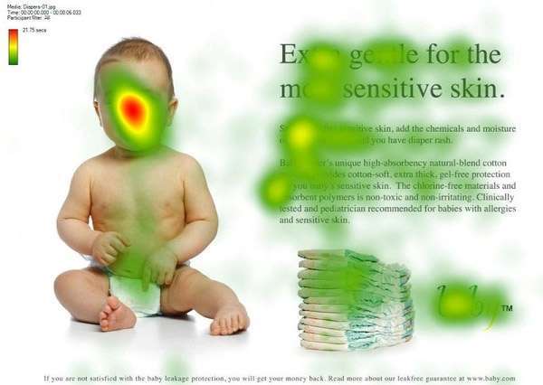
Both ads were exactly the same, save for the direction the baby was facing. When the baby faced forward, people’s eyes were generally drawn to the baby’s face only. But when the baby faced the copy, people followed its gaze and spent more time perusing the actual text as well.
The visuals you choose are an integral part of your overall message, so make sure they’re working in tandem with your text elements.
5. Create actionable calls-to-action (CTAs)
You know the drill from every other landing page guide out there:
- Locate your CTA above the fold so it’s easy to find;
- Use contrasting colors so your CTA becomes the most visually important element on the page; and
- Use directional cues to guide your visitors’ eyes to the CTA.
I’m just going to add two little things to the mix.
First, your CTA needs to be action-oriented. It should clearly establish what your visitor is doing when they fill out your form — for example: Download eBook; Subscribe to Newsletter; Sign up for an account.
Second, your CTA needs to be actionable. It should clearly establish what’s going to happen once your visitor performs the action discussed above — and that result should directly correspond with the message that your entire landing page has been built around.
For example, why should someone need to download yet another eBook? Make the benefit clear: Download eBook to optimize your landing pages.
6. Motivate visitors to complete your form
Many content marketers out there will advocate for keeping the forms as short as possible, i.e. your visitors should have to fill out the smallest number of fields possible, in order to make it easier for them to convert.
These short forms will simply ask for a visitor’s contact information, such as an email address.
While you have to collect your visitor’s contact information (what would be the point otherwise), do keep in mind that that’s the information your visitors are going to find most difficult to share.
People hate being contacted out of the blue by companies they don’t otherwise have a relationship with. That’s why, when asked for their email addresses, 60 percent of visitors will deliberately fill in the wrong information.
Could visitors be persuaded to share their contact info in a longer form?
A case study about a company called Advanced Grass indicates it’s possible: They increased their conversion rate by 214 percent by adding questions to their form that would clearly establish what their visitors needed.
At the start of their form, Advanced Grass asked how many square feet of artificial turf the visitor wanted to buy. In other words, visitors began by making a smaller initial commitment to sharing information that pre-qualified them as needing what you have to offer.
This set them up to make the bigger commitment of sharing their contact information at the end of the form.
This worked because, psychologically speaking, people like to be consistent with what they have previously committed to doing — especially when their prior commitment is directly related to getting what they need.
So, to capitalize on this principle, include useful questions that qualify where your visitors are in the buyer’s journey — and ask them before asking for your visitors’ contact information.

7. Include strong social proof
Reviews, testimonials, press mentions, social media interactions… people are more likely to trust your product if they see that others also trust your product.
But this is a two-way street. Strong social proof can boost your credibility; weak social proof can backfire big time.
A Kissmetrics A/B test found that one company actually drove 102 percent more conversions after removing social proof from their landing page.
If your social proof reads like something you could have made up over a board meeting (think vague praise from anonymized random people; “Love it!” — John D., “Highly recommended” — Jane K.), your visitors will find these testimonials more distracting than convincing.
People gravitate toward two types of social proof: authority and people like themselves. They want to know that credible, reputable sources approve of your work, and they also want to know that your work is directly relevant to their own lives.
The metaphorical God is in the details. If you’re citing an authoritative review, make sure it comes from an immediately recognizable and reliable source. (Simply slapping “Famous author” behind a random person’s name does not actually build credibility.) If you’re citing a customer testimonial, make sure that person goes into the specifics of how your work directly helped them.
8. Optimize with A/B testing
I can write at length about the best practices I’ve generally observed in the industry, but at the end of the day, there will always be exceptions to the rule.
Sometimes, and especially when the actual data from your actual visitors indicates this, the best practice is to throw out all the best practice advice you’ve read.
If you’re part of a smaller company that receives less traffic, you may feel like you don’t have the time or budget to reach statistically significant numbers. But — and this could apply to bigger companies too! — this really just means that you shouldn’t waste scarce resources A/B testing small tweaks. For example, you won’t get usable data if you only change the verb in your headline.
Instead, you should focus on testing high-impact changes. Drastically alter the page’s message. Drastically alter the way the page looks. A big and noticeable change usually leads to the same effect on your analytics.
Over time, you’ll learn which elements of your landing page are driving the most conversions.
9. Follow up
A visitor who submits your form is now a lead — and by nurturing that relationship, you make it much more likely to convert them into paying customers.
At minimum, your landing page should redirect to a thank you page after a visitor submits the form. An optimized thank you page creates more opportunities for your lead to continue engaging with your brand’s content.
Ideally, you want to set up an automated workflow, beginning with a follow-up email after your lead submits the form on your landing page. Hubspot’s lead nurturing research shows that “the odds of converting a lead into a sales opportunity are exponentially higher when the lead is contacted immediately following a website conversion.”
Looking to take your lead generation efforts to the next level? In our free eBook, you’ll learn our best tips and tricks for running a successful lead generation campaign. Download it now.
Recent Posts


UNLOCK YOUR POTENTIAL IN 30 MINUTES
👀 Seeking efficient solutions to the business, marketing, or mindset challenges you face?
🚀 Ready to take your business to the next level?
⏰ Short on time?
QuickWin Coaching is designed with you in mind. Why waste hours in lengthy coaching sessions when you can achieve remarkable results in a mere 30 minutes?
